

U.S. State Highway Shields Ranked
Every state has highways— they’re an important piece of infrastructure that allow millions of people to travel places via car or bus every day. There’s no doubt they’re important, which is why there are so many of them all over the country, divided into multiple categories:
Interstate highways, which are denoted by the iconic red-and-blue shield and are generally regarded as the highway system that is comprised of all the “major” highways. Approximately a quarter of all miles driven by vehicle in 2020 was on the approximately 49 thousand miles of Interstate highway in the country. Interstate highways are standardized on a federal level, so they (sort of) conform to a pattern (explained here).
U.S. Routes, which are denoted by the also iconic black and white spade-shaped shield. The U.S. Route system was formed in 1926 and serves loosely as the precursor to the Interstate system in 1956.
State highways, which are smaller routes that are maintained by the state and not standardized on a federal level. They can range from full-sized highways that are maintained to Interstate standards if they heavily-traveled (see CA-24) to regular roads.
County highways, which are the smallest denomination of highway maintained by the counties they reside in. They are not really standardized and can range from nicely paved multilane roads with heavy traffic to poorly maintained dirt roads.
Interstates, U.S. Routes, and county highways all have either one design or mainly one design with a few state exceptions. However, all 50 states have a different shield design for their state highways, which is what I am going to rank today.
50. Utah

Utah’s shield is a white beehive on a black background. There isn’t really anything special about it, but I hate the look of the beehive. I don’t care if it’s the state emblem— it looks too lumpy to be on a road sign.
49. Vermont
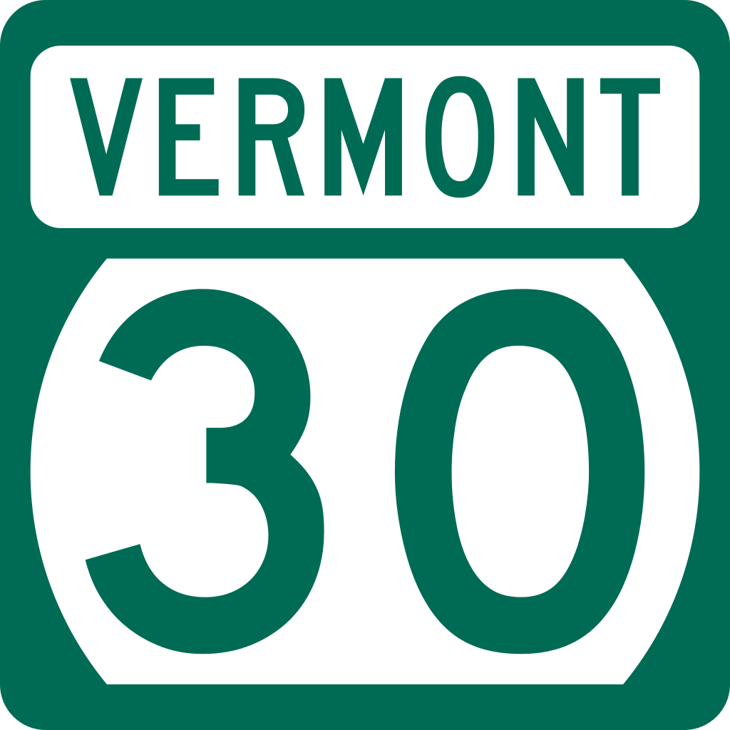
Vermont’s shield is an odd-looking rectangle on top of a cut-off circle that for some reason is green. The fact that the margins are oh-so-slightly uneven, too…
48. South Dakota
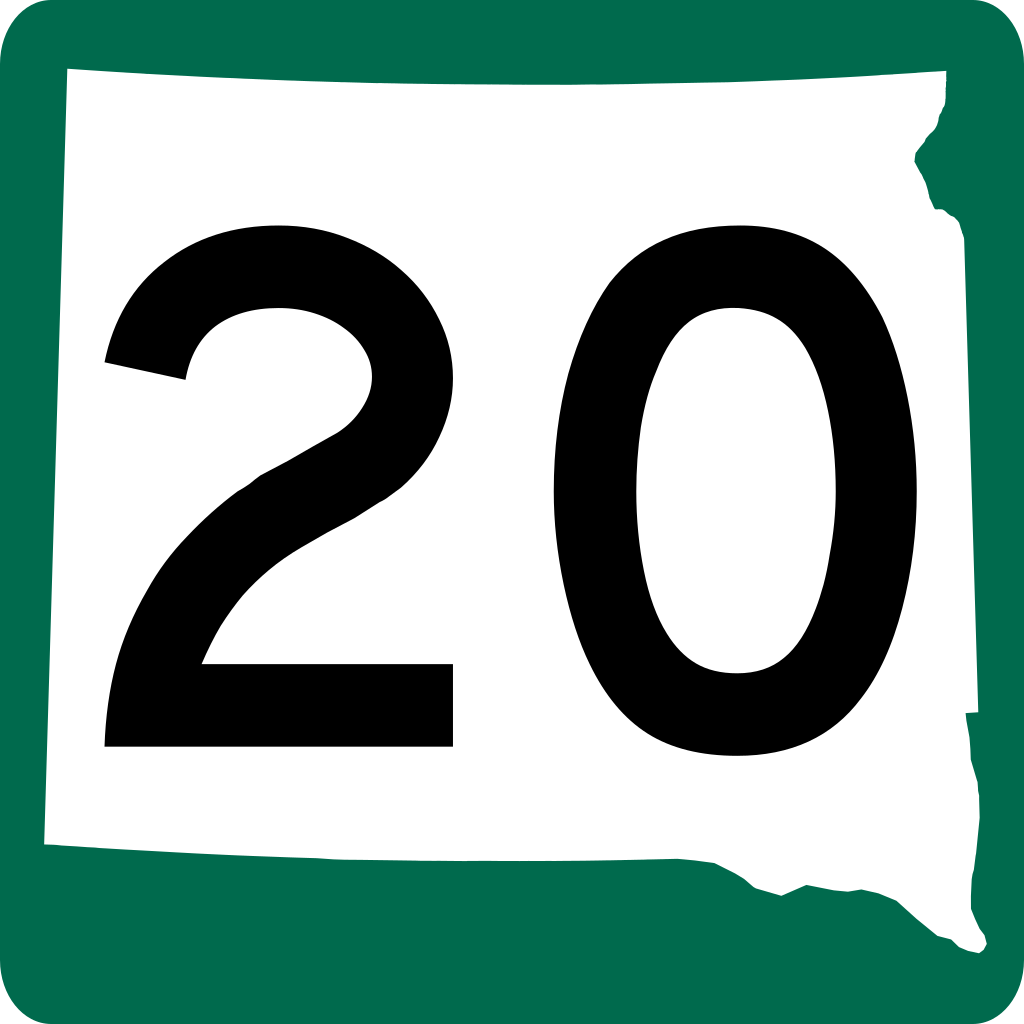
South Dakota’s shield is the first on this list that features the state’s shape as part of the design. However, it’s squished horizontally and the color choice is jarring. Pretty gross.
47. Washington

Washington’s shield is a silhouette of President Washington’s head, which makes for a strange shape on a sign that is supposed to be sort of minimalistic. Also, due to the shape, the highway’s number has to be compacted in the middle, which is even more noticeable with three-digit highways.
46. Idaho
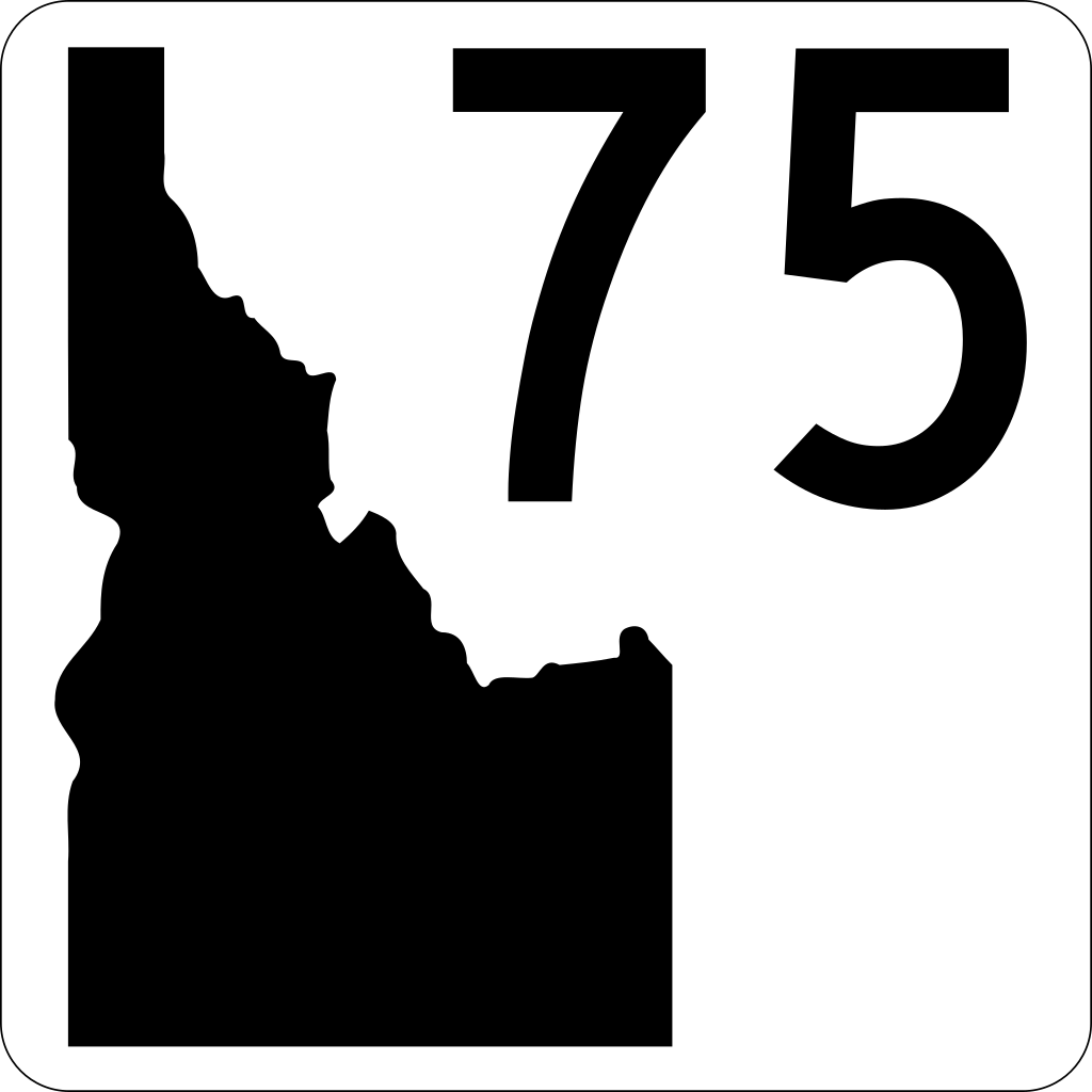
Idaho’s shield is white with a black cutout of the state and the number of the highway shoved in the top right corner. Why does the silhouette take up more space than the numbers??
45. Alabama

Alabama’s shield is black with a cutout of the state that is squished so much that it’s comical. Maybe they should have squared off their borders before making this design… but at least the number’s centered.
44. Louisiana

Louisiana’s shield is black with a cutout of the state… as well as the state abbreviation, in case you didn’t know what state you were driving in or recognize the shape of the state. The weird shape of the state in addition to the abbreviation pushes and shrinks down the highway number.
43. Colorado

Colorado’s shield is probably the first non-egregious-looking one of the list. However, it has the most amount of unique colors of any shield in the country, which is almost distracting.
42. Nevada

Nevada’s shield is black with a proportionally-sized cutout of the state containing the number and the name of the state (once again, in case you couldn’t recognize the outline). It’s passable, but the text is unnecessary and misrepresents the borders of the state to anyone who doesn’t know what Nevada looks like.
35. (6-way tie)

Rhode Island, Maryland, Indiana, Illinois, Montana, and North Dakota all have pretty similar (and basic) shields, with the name of the state and the highway number on a white background with a black outline. They’re simple enough, get the job done, and aren’t super over-the-top.
34. Texas

You might think that Texas’s looks just the same as the 6 just mentioned, but there’s something about having the highway number on the top that makes it more attractive— perhaps drawing more attention to the number is what makes it look better.
33. New Mexico

New Mexico’s shield sports an attention-grabbing red circle with lines on a white circle on a black background. The highway number is nice and centered, too, if a little small.
32. North Carolina

North Carolina’s shield is fine, but the diamond shape with no other markings kind of makes it look like a caution sign.
28. (4-way tie)

All three of these designs— from Connecticut, Maine/Massachusetts, and West Virginia respectively— are all so non-descript that they’re boring. However, they are super simple, visible, and don’t try any weird gimmicks, so they’re pretty good in my book.
27. Wisconsin
Wisconsin’s shield is simple and clean, sporting a triangle-in-rounded-rectangle shape for the “state trunk” highways in the state. It’s not my favorite shape, but it’s better than the squares before.
26. Pennsylvania

Pennsylvania has a vase-shaped figure on the shield, which makes for an odd-looking but unique design.
25. Oregon

Oregon is the first state to have a design that balances simplicity with visual appeal. The shape on the inside isn’t a weird vase, but it’s also not just a plain old square.
24. Virginia

Virginia’s shield is pretty close to that of Oregon’s, but the sides are less slanted and the bottom is pointed for a bolder look.
20. Delaware/Iowa/Mississippi/New Jersey

All of these states sport the same shield: a plain circle in a box— but what’s wrong with that? It’s symmetrical, elegant, and to-the-point.
19. Hawaii

Hawaii’s shield is pretty similar to the ones that we’ve seen so far with the exception of the guitar pick shape. However, another thing you might have noticed is the small lettering for the 11 in the example above for HI-11’s shield. The font size of the number stays constant throughout the state, so both HI-11 and HI-7145 have the same-sized lettering on their designs.
18. Oklahoma

Oklahoma’s shield is nice-looking and not boring— you know exactly what state you’re in and the number is in a nice, no-nonsense bolded text.
17. Arizona

In the past, I’ve dissed a lot of the state shape + name combos, but Arizona does it right with their design. The state of the shape is minimal and near-proportional; the name of the state is small enough to not be distracting; the highway number is in large text that makes it the focus of the sign, which is what it should be like.
16. Minnesota

Minnesota’s shield incorporates a navy and yellow color scheme that contrasts nicely with the white lettering for the highway number. The silhouette and name of the state are tucked nicely up at top, providing a balanced look.
15. Wyoming

Wyoming’s shield is a pretty simple black on yellow with the state’s name, the highway number front and center, and the Wyoming Bucking Horse and Rider to provide for a unique reference to the history of the state.
14. Alaska

Alaska’s shield is of similar fashion to Wyoming’s— the name of the state and the highway numbering in large letters with a symbol of the state below. In this case, it’s the Big Dipper and the North Star, symbolizing the bears that are native to the state and the ability to find true north with the constellation.
13. Nebraska

Nebraska’s shield is also similar, but this time with a wider version of the FHWA’s font and an image of oxen pulling a wagon. The upside-down trapezoid shape also adds some character to this shield.
12. Tennessee

Tennessee’s shield is the first on the list to use a font differing from the FHWA’s Highway Gothic. The outline of Tennessee at the bottom with the text inside is an elegant way to differ the sign from other states’ without being overly distracting.
11. Missouri

Perhaps Missouri is lucky with its decently equal height and width, but this shield is minimalistic while presenting all of the information you need nicely.
10. Michigan

Michigan’s shield is a white diamond on black with a simple M above the highway number. Again, it presents all the info you need without overdoing it.
9. Georgia
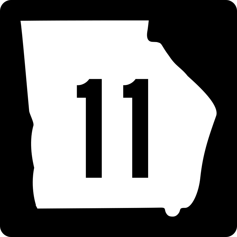
Georgia’s shield is exactly the same as Missouri’s, but the state is just shaped better, allowing the borders to be more uniform.
8. New Hampshire

New Hampshire’s shield is a silhouette, but not of the state; instead, it’s of the Old Man of the Mountain, a granite formation in the state that resembles a man. The silhouette is shaped in a way that provides character without making the highway number too small.
7. New York

New York’s shield is another minimalistic white shape on black, but this time, it’s not boring. The shape is quite distinct while being pleasing to the eyes.
6. Florida

Florida’s shield is similar to that of Oklahoma’s, but the border of the shape now makes way for the numbering and the outline is thicker, which looks nicer.
5. South Carolina

South Carolina’s shield is a nice dark navy color. It has the name of the state at the top, a silhouette of the state, and a tree and crescent moon inside of it. The highway numbering is nice and legible. All around, South Carolina’s shield is very nice.
4. California

As a California native, maybe I’m a little biased, but I love the spade shape. The white on green separates it from all of the other shields, which also gives it a super distinctive look that’s different from not only the other state shields but also the Interstate and U.S. Route ones as well.
3. Arkansas

Arkansas’s is another shield done well, similar to that of Georgia and Missouri. However, the shape of Arkansas helps the shield maximize the size of the number in this case, and it looks really nice on the shield’s design.
2. Ohio

Quite similarly, Ohio uses the white state on black design, but the symmetry of the state makes the shield looks nicer than Arkansas’s or Georgia’s.
1. Kansas

At the top position, we have Kansas, or the Sunflower State. The shield uses a practically symmetrical sunflower design that is gorgeous to the eyes, practical, and not at all plain. The shade of yellow used accompanied with the unique floral shape makes it distinct from any other shield, including the U.S. Route and Interstate ones. Just don’t look at the ones for three-digit highways.
Conclusion
There’s every single state’s state highway shield. It was interesting to compile this list and see how states manage how the shield looks, whether it be just a white shape on black or something unique that incorporates stuff significant to the state. Maybe (hopefully) some of these (Utah) will see an update at some point in the near future!